Topics in Photographic Preservation 2005, Volume 11, Article 6 (pp. 38-56)
Presented at the 2005 PMG Winter Meeting, Vancouver, British Columbia
This project is sponsored by the Advanced Residency Program in Photograph Conservation (ARP), funded by the Andrew W. Mellon Foundation. It was conducted at Image Permanence Institute (IPI) under the direction of James Reilly and Douglas Nishimura.
The characterization of black-and-white silver gelatin prints for educational purposes has been a part of the ARP research agenda since the program's beginning. In 2001, Tania Passafiume, a first-cycle ARP fellow, produced the Silver Gelatin DOP Sample Book, a comparative reference tool for black-and-white photographic prints. Klaus Pollmeier, also a first-cycle fellow, developed the edge reflection analysis technique to measure and quantify surface texture.
Our approach to this research effort has focused on the development of a system for imaging and describing photographic prints using five key characteristics: thickness, base tint, image hue, sheen, and surface texture. We are particularly interested in combining visual methods that are accessible to a wide audience. The purpose of our research is to show the complexity and range of black-and-white silver gelatin print surfaces, and not simply to create an identification chart. Manufacturers of photographic papers selected characteristics for specific applications, and thus produced many different papers. Our work is directed toward providing an image-based educational tool to convey that information to curators, dealers, collectors, and caretakers of photographs.
We are not alone in attempting to advance this research agenda. The conservation community has a strong interest in building this body of knowledge, because so many important twentieth-century photographs were created on this material. Research on the characterization of black-and-white silver gelatin prints is being done by the Getty Conservation Institute, the Detroit Institute of Arts, Paul Messier (Conservation of Photographs and Works on Paper), the Centre de Recherches sur la Conservation des Documents Graphiques (CRCDG) in Paris; and the Fachhochschule für Technik und Wirtschaft in Berlin. The ARP research related to the characterization of black-and-white silver gelatin prints is not about analysis or authentication; rather it is specifically aimed at education and providing educational tools for conservators.
The twentieth century generated a wide range of photographic surface textures, sheens, paper thicknesses, image hues, paper tones, and so on. Our investigation focused on black-and-white silver gelatin photographic papers produced by Eastman Kodak Company. Forty-three of the black-and-white fiber-based photographic papers produced by Kodak from 1895 to 2000 are listed below.
| Ad-Type | Kodabromide | Recording Paper |
| Aristo | Kodak Contact | Reflex Copy |
| Athena | Kodak Nos. 1 and 2 | School Paper |
| Autopositive | Kodalure | Sensitized Silver Paper |
| Azo | Medalist | Sepia |
| Bromide | Mezzo-Tone | Solar Bromide |
| Dekko | Mural | Solio |
| Ektalure | Opal | Transferotype Paper |
| Ektamatic | Panalure | Velite |
| Electrocardiograph Paper | Platino Bromide | Velox |
| Elite | Polycontrast | Velvet Green |
| Exo Cloth | Polyfiber | Vitava |
| Illustrator | Polylure | |
| Imbibition | Portalure | |
| Karsak | Proofing Paper |
We researched the literature and studied the Kodak Rochester sales catalogues to find how many photographic papers were produced and when they were in production. Unfortunately, because Kodak company policy dictates record retention of only five years, much of the manufacturing history of black-and-white photographic papers has been lost. However, we were fortunate to have the opportunity to interview a number of Kodak retirees, who were very helpful in putting the story together.
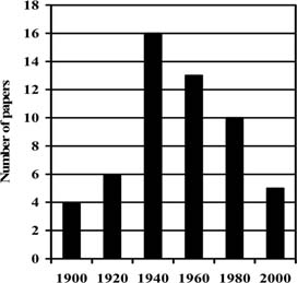
Figure 1 shows the number of different black-and-white fiber-based photographic paper brand names produced by Kodak per year from 1900 to 2000. In 1900 only four different paper brand names were available. Between 1935 and 1940, the number of papers increased to approximately sixteen. That number gradually diminished with the introduction of color photographic papers in the early 1960s and resin-coated papers in 1972. Ten fiber-based black-and-white paper brand names were produced by Kodak in 1980. Afterward, production continued to decline as a result of the increased applications of color photography and perhaps because of the development of digital photography. In 2000, only five different paper brand names were being produced.
Fig. 1: Number of Kodak black-and-white paper brand names produced per year
It is important to understand that the data in figure 1 refer only to the number of different paper brand names, such as Kodabromide, Medalist, and Velox. These individual papers were available in different weights, surfaces, and photographic grades, so the total number of different papers produced over the years was actually much higher. It also should be remembered that these numbers are for Eastman Kodak (USA, Canada) only. Other manufacturers were producing a wide variety of papers as well. The vast number of photographic papers that were in use in the twentieth century confirms the need for a method by which to characterize them.
In order to reduce and simplify our task, we studied only eleven samples of the fiber-based black-and-white photographic papers listed in the 1966 Kodak B/W Darkroom Dataguide, R-20. This was a publication that included eleven sample prints and was intended to educate users about the nature and applications of Kodak black-and-white materials. The photographic paper samples included in the Dataguide were machine-processed in a Kodak Continuous Paper Processor, Model 4T. Four processing sections developed, fixed, washed, and toned (if toning was required). Since the Dataguide was published in 1966, the date of the samples is known. Each photographic paper is labeled and printed with a picture representative of the application for which the paper was designed and marketed.
This research has revealed a great deal of information about the engineering of the different photographic surfaces. Table I lists some of the surfaces available for Kodak black-and-white photographic papers. Kodak gave each unique surface a letter designation, for example, paper F, used for smooth, glossy commercial prints, had a very high gelatin content overcoat and therefore could be ferrotyped to produce a higher gloss finish. Paper A was a light-weight paper with no baryta layer, which made it suitable for use in reports and in the preparation of big mail order catalogs for retail stores because it could be folded without cracking. Some papers were heavily textured and looked like canvas. The deeply marked papers such as R (tweed) and X (tapestry) used special felts during the manufacture of the paper base that impressed a deep pattern into one side of the paper before the baryta layer was applied. Others papers like Y (silk) were baryta-coated first and then passed over a textured roller that impressed the design into the paper. These marks were not deep but in some cases, like paper Y (silk), were quite detailed.
Table I: Surface characteristics of Kodak black-and-white photographic papers
| Paper | Characteristics |
| A | Smooth, lustre, white, on light-weight base |
| B | Smooth, lustre, cream white |
| D | Fine-grained, high lustre, snow white |
| E | Fine-grained, lustre |
| F | Smooth, glossy |
| G | Fine-grained, lustre, cream white |
| J | Smooth, high lustre white |
| K | Fine-grained, high lustre |
| N | Smooth, between lustre and matte |
| R | Tweed, lustre |
| V | Suede, matte |
| X | Tapestry, lustre |
| Y | Silk, high lustre |
| Z | Tapestry, lustre, old ivory |
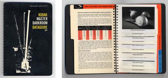
Fig. 2: 1966 Kodak B/W Darkroom Dataguide, R-20
The eleven photographic paper samples studied are listed below. Most of the information that follows relates only to these eleven samples.
Kodak Polycontrast Paper F
Kodabromide Paper A
Kodak Ektalure Paper E
Kodak Polylure Paper G
Kodak Medalist Paper J
Kodak Ektalure Paper K
Kodak Opal Paper V
Kodak Polycontrast Rapid Paper N
Kodak Mural Paper R
Kodak Ektalure Paper X
Kodak Polylure Paper Y
In the Kodak B/W Darkroom Dataguide, R-20 five key characteristics are discussed: the thickness of the paper, the tint of the paper base, the image tone, the sheen, and the texture of the surface.
Many descriptive terms have been coined to cover the variations within each category of Kodak photographic papers. For this introductory study, we have chosen to retain the descriptive terms used in the Dataguide, but do not suggest them as the best terminology for the purpose. The following information describes the key characteristics specifically for the eleven photographic papers chosen for this study.
Among the paper samples studied, three different thicknesses are found: a light weight, a single weight and a double weight, where weight of the paper corresponds to its thickness. Because of expansion and contraction of the paper stock during processing, a variation of thickness was allowed, according to the ANSI standard specification for paper manufacturing. These ranges are indicated below:
| Light Weight | 0.0043 – 0.0059 in. (0.1092 – 0.1499 mm) |
| Single Weight | 0.0059 – 0.0083 in. (0.1499 – 0.2108 mm) |
| Double Weight | 0.0111 – 0.019 in. (0.2819 – 0.4826 mm) |
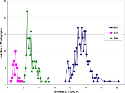
Fig. 3: Thickness comparison chart. DW = double weight; LW = lightweight; SW = single weight
In 2003 Lauren Streusand1, an intern at IPI, did measurements on 500 Kodak papers taken from 45 copies of the Kodak B/W Darkroom Dataguide, R-20. The results, here plotted graphically with the number of papers of a given thickness as the function of the paper thickness, show three significant bell-shaped curves representing the three categories (see figure 3).
There are two variations of base tint among the papers studied: white and cream white. Spectrophotometer readings were taken at the edges of the papers. Data for Polycontrast F, Ektalure E, Medalist J, and Polycontrast Rapid N papers are shown in figure 4. Data for Polylure G, Ektalure K, Ektalure X, and Polylure Y papers are shown in figure 5. The preliminary results show two different and characteristic curves for spectral distribution related to the white and the cream white base tint. The graphs show spectral distribution in percent reflectance as a function of wavelength (note, these measurements may include the effect of optical brightening agents). The curves indicate that the white paper tone reflects more blue than the cream white paper, making it appear cooler. This corresponds with available information on the pigments used in the paper manufacturing. The pigment in the white paper base was blue with the addition of optical brighteners. For the cream white tone, the pigments were yellow and red, and no optical brighteners were used. Kodak was unique in having the paper tinted in the paper mill. The papers in each category show very similar spectral distribution, which confirms what we were told by former Kodak employees: that the production of the paper was made as efficient as possible by using the same paper base for many products.
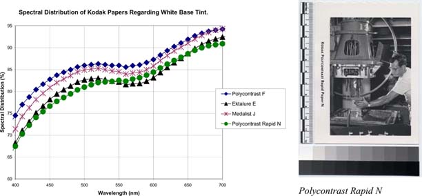
Fig. 4: Spectral distribution for white paper base
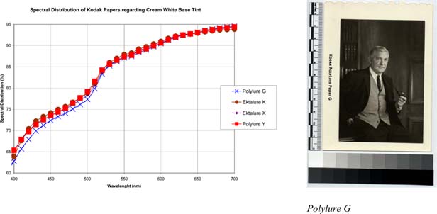
Fig. 5: Spectral distribution for cream white paper base
The two base tints were intended for different applications. For example, the white Polycontrast Rapid N was typically advertised for industrial photographs, whereas the warmer cream white Polylure G paper was advertised for portraits. In the Dataguide, the intended application for each paper was illustrated with a representative image (see figures 4 and 5). Three of the papers studied, Opal V, Kodabromide A, and Mural R did not fit into the white and cream white base tint categories. Kodabromide A is described as having a white base tint, and Mural R is described as having a cream white base tint; however, their spectral distributions are very similar to each other (see figure 6), and both are quite different from the spectral distributions shown in figures 4 and 5. This might indicate a third variation in the manufacturing of base tints. Spectral distribution for these three papers is shown in figure 6.
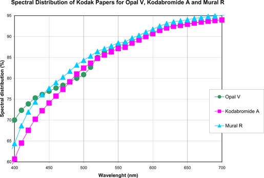
Fig. 6: Spectral distribution for Opal V, Kodabromide A, and Mural R
Opal V is categorized in the Dataguide as cream white, but it has a slightly different spectral distribution with more reflectance in the blue tone area (400–500nm). The matting agent incorporated into the surface of the paper during the coating might cause the difference in spectral reflectance (see the magnified image of the suede surface texture in figure 8). The matting agent consists of fine grains of silica or starch2, which alter the light reflection off the surface of the paper.
In the 1950s, Kodak standardized the descriptive terms for image tone in an attempt to eliminate the confusion caused when different manufacturers would use different terms to describe the same image tone. There are three standardized image tones represented among the eleven papers studied: neutral black, warm black, and brown black.
Sheen and texture are closely linked surface characteristics of photographic papers. Sheen refers to the light reflected off the paper's surface. Within the group of eleven papers, four different descriptive terms are used to describe sheen: glossy, high lustre, lustre, and matte (figure 7). The use of specular light to illustrate the varying degrees of reflection from glossy to matte provides useful images for comparing the sheen of different papers. The lustre surface was used on six of the eleven papers in the Dataguide, indicating that it probably was a popular sheen.
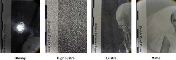
Fig. 7: Examples of surface sheen
The last of the five key characteristics is surface texture. Six different textures are found among the eleven papers studied: smooth, fine-grained, tapestry, tweed, silk, and suede. The terms describe very well the surfaces being imitated (figure 8).
The selection of the paper with the best combination of described characteristics for a certain image is subjective. However, in the Dataguide, Kodak did recommend different papers for certain image subjects. For example, the rough-textured Ektalure X paper, with its cream white, tapestry lustre surface was intended to emphasize vigor and strength in a subject (e.g., a portrait of an individual with strong features). According to Kodak, this paper was frequently colored with opaque oils, to give the effect of an oil painting on canvas. The Polylure Y paper, which was intended to simulate silk, was popular for expressing brightness in an image (e.g., snow scenes, seascapes, or white textiles in wedding gowns).
As shown in table I, Kodak used a letter system to pair descriptions of sheen and texture. For example, smooth glossy, smooth lustre, and so on. A letter was assigned to these combinations, for example F was a smooth glossy surface and A was a smooth luster surface.
The choice of letter was not necessarily related to a certain application or engineered characteristic of the specific paper. Some letters were chosen to honor the designer of the paper by using for example the first letter of the designer's family name or the name of one of the designer's children.3 The letter system was not used consistently over time; for example, Kodak Ektalure paper X (tapestry lustre) was called Kodak Opal Paper Z in a catalog from 19524. We do not, therefore, recommend the letter system when characterizing the paper surfaces, but rather the more easily recognized descriptive terms for sheen and texture.
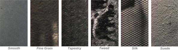
Fig. 8: Examples of surface texture
The surfaces of the photographic paper samples in the 1966 Kodak B/W Darkroom Dataguide, R-20 are visually characterized through accessible imaging techniques to combine and juxtapose images illustrating the five key characteristics. Not only are individual descriptive images of a given physical characteristic or surface feature informative, but carefully chosen comparative sets of images utilizing specialized imaging techniques are especially valuable for the study of the great diversity in black-and-white silver gelatin photographic print surfaces.
The combined image characterization method uses five imaging techniques to illustrate the five key characteristics previously described. The following images were taken of the smooth glossy ferrotyped Kodak Polycontrast paper (figure 9) and the highly engineered patterned and textured silk lustre Kodak Polylure paper (figure 10).
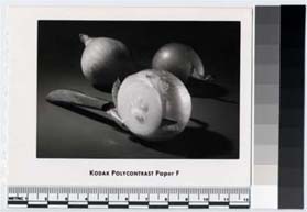
Fig. 9: Kodak Polycontrast Paper Smooth Glossy
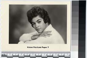
Fig. 10: Kodak Polylure Paper Silk Lustre
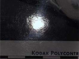
Fig. 11: Kodak Polycontrast Paper Smooth Glossy
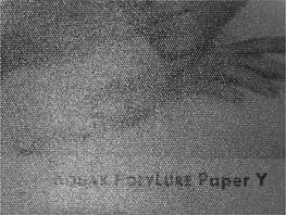
Fig. 12: Kodak Polylure Paper Silk Lustre
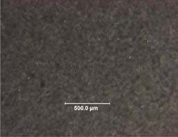
Fig. 13: Kodak Polycontrast Paper Smooth Glossy
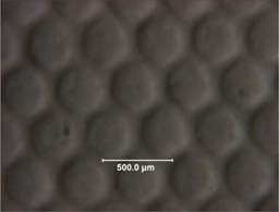
Fig. 14: Kodak Polylure Paper Silk Lustre
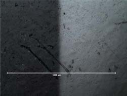
Fig. 15: Kodak Polycontrast Paper Smooth Glossy
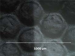
Fig. 16: Kodak Polylure Paper Silk Lustre
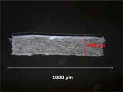
Fig. 17: Kodak Polycontrast Paper Smooth Glossy
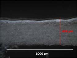
Fig. 18: Kodak Polylure Paper Silk Lustre
Macrospecular illumination is informative as an imaging standard because it closely approximates the experience of looking at a photograph surface with grazing incident light to examine its surface reflective qualities. These images were created with an Olympus E-20 SLR digital camera with a macro lens to produce a 2:1 actual image size. A narrow, focusable-beam tungsten light source is reflected off a beam-splitter mirror, set at 45° to the plane of the photograph (see figure 19).
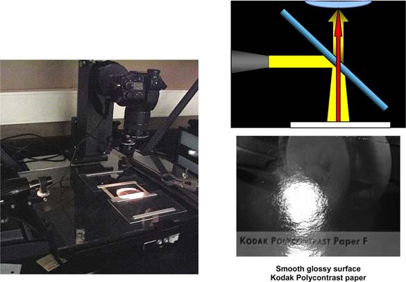
Fig. 19: Setup for macrospecular illumination
Each imaging technique can be used to combine images in an ordered set for direct comparison. For example, the macrospecular images can be qualitatively ordered to show the degree to which a focused cone of light is reflected back to the camera lens, diffused, or reflected internally by the top surface layer. Digital capture allows for comparative sets of images to be easily arranged in a desired order. The four reference images shown in figure 20 demonstrate the progressive reduction of reflective surface quality, from smooth glossy to suede matte.
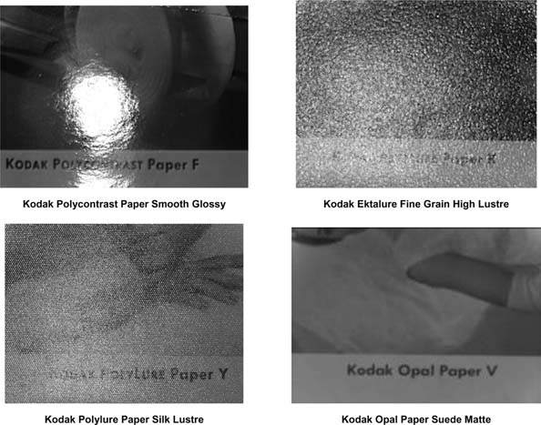
Fig. 20: Macrospecular comparative set
Low-angle raking light, cast by fiber-optic illuminators positioned at a 10° angle to the plane of the photograph, dramatically shows the texture of the photograph surface. Comparative sets of images were taken through a stereomicroscope and a compound microscope and show the texture of the silk lustre surface. Low magnification (10x) is similar to examination of the surface with a hand-held magnifier in oblique light. With higher magnification (50x) it is possible to distinguish more subtle surface features and the microstructure of the photograph surface (see figure 21).
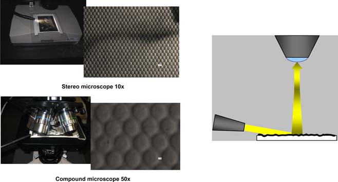
Fig. 21: Kodak Polylure paper silk lustre surface viewed through stereo microscope (10x) and compound microscope (50x)
This comparative series follows the order shown in the previous comparative set (figure 20), from the smooth high lustre to the suede-matte surface. This comparison shows the relative size, shape, and distribution of the surface elements that define the texture.
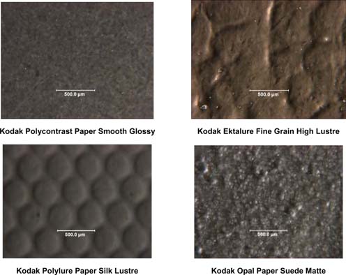
Fig. 22: Raking light comparative set
Brightfield, or axial, illumination at 100x records the reflective details and the underlying topographical structure of the surface. As in macrospecular illumination, the illumination and imaging light paths are perpendicular to the photograph surface. This technique reveals subtle characteristics of surface microstructure that complement the information about surface reflective quality revealed in macrospecular illumination and its topography viewed in the raking-light micrographs. The brightfield micrograph images (see figure 23) were taken at the edge of the image; image silver is on the left side and the non image paper base is on the right side of the image.
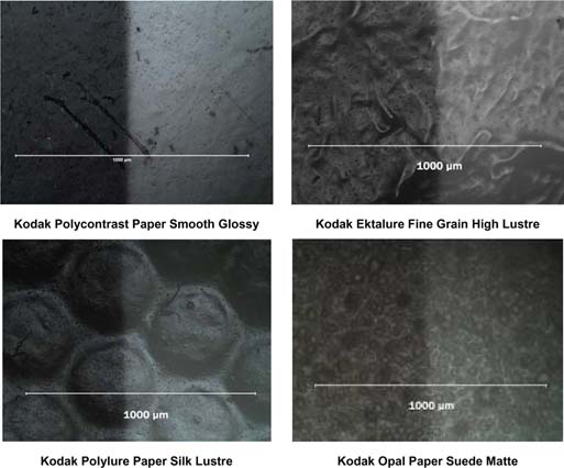
Fig. 23: Brightfield comparative set
The final imaging technique used in the combined image characterization is the cross section. This technique shows the underlying photograph structure and illustrates how the photograph was engineered to create its distinctive surface characteristics.
In this technique, sections are cut by hand with a double-edged razor blade, which is an efficient and easy method that requires little setup (see figure 24). The thin sections are placed on their side under a cover slip in an aliphatic solvent, such as petroleum benzine, to improve depth-of-field and increase layer contrast. The images are taken with darkfield illumination. This technique is destructive; however, it is an essential component of this research in building a comparative imaging reference.
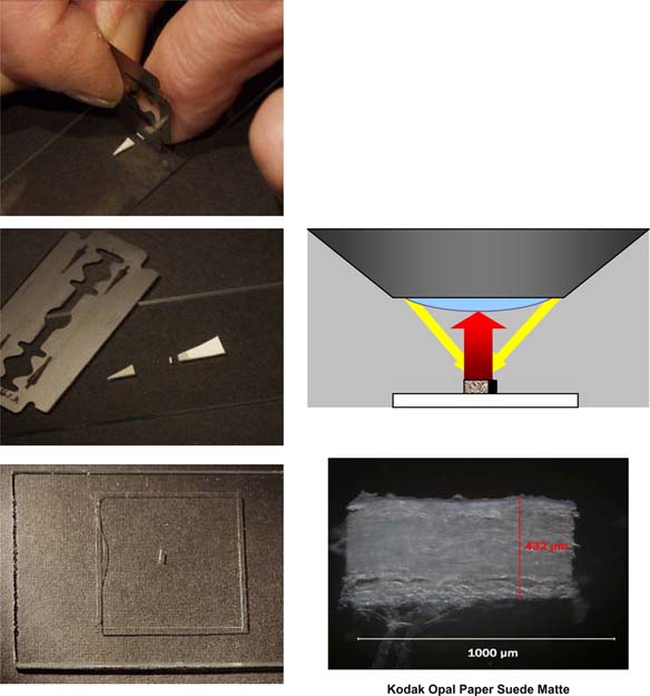
Fig. 24: Setup for cross-sectioning
The comparative set of cross sections imaged at 100x (figure 25) allows for direct comparison of structure, layer thickness, and surface features. These reference images provide easily understood visual information about the way the papers were engineered for their particular application and aesthetic qualities. Adding the calibration feature from the microscope imaging software allows for thickness measurements of the discreet layers comprising the photograph structure.
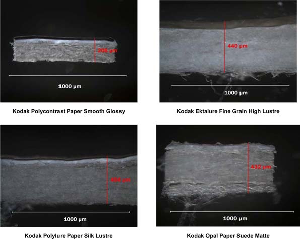
Fig. 25: Cross sections comparative set
The combined image set of the macrospecular illumination, the raking light, the brightfield illumination, and the cross section, allow to show the structure and engineering features of the photographic surface.
In figure 26, the Kodak Polycontrast paper has a thick baryta and a heavy image-bearing gelatin layers that create a very smooth, glossy, ferrotypable surface. The smooth glossy surface was the general favorite for pictures to be reproduced photomechanically.
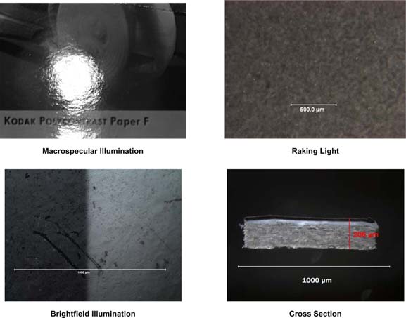
Fig. 26: Kodak Polycontrast Paper Smooth Glossy
In figure 27, the Polylure paper silk lustre surface has a discernable baryta layer; the undulations of the surface structure are carried through to the top layer, evidence of the marking roller impressing its distinctive pattern into the baryta layer during manufacture. The silk lustre surface was popular for wedding photography, as well as a very attractive medium for expressing brightness in snow scenes, seascapes, etc.
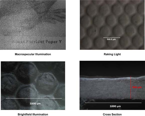
Fig. 27: Kodak Polylure Paper Silk Lustre
Combining the historical context for this set of photographic papers, understanding the terms used in their fabrication and marketing, and creating a visual reference of characteristics is intended to increase the appreciation of all that is behind the term black-and-white silver gelatin fiber-based photograph. Although this characterization method is based on a limited group of photographic papers from a defined period, clearly it can be extended to the broad range of Kodak products, and applied as well to photographic papers produced by other major twentieth-century manufacturers.
The immediate goal of this research has been to provide a combined image-based approach to characterizing photographs. The scanned image, images of the surface in raking and specular illumination, micrographs of the surface in brightfield illumination, and the cross section were chosen to describe the five key characteristics of a photographic print: the thickness of the paper, the tint of the paper base, the image tone, the sheen, and the texture of the surface.
The method of direct comparison of surfaces and characteristics through sets of images that have been created in standardized imaging conditions is the first step toward establishing uniform standards for characterization imaging and relating visual characteristics to the known technical and artistic information available about the characteristics of twentieth-century black-and-white photographic papers. We believe that this research will give the photograph conservator an educational tool that can be used to foster dialogue on the rich diversity and complexity of black-and-white silver gelatin prints. To that end, this work will culminate in an educational publication dedicated to increasing the understanding and appreciation of the twentieth-century black-and-white silver gelatin print by a wide audience.
An electronic copy of this paper in pdf format may be viewed at the website of the Advanced Residency Program in Photograph Conservation: www.arp-geh.org.
The authors wish to thank the following for supporting, encouraging, and participating in this project: James Reilly, Grant Romer, Douglas Nishimura, Pilar Martinez, Dr. Elizabeth Goins, Dr. Franziska Frey, Debra Hamel, Lauren Streusand, Karen Santoro, Robert Shanebrook, David Valvo, David Wyble and the Munsell Lab at the Rochester Institute of Technology, and the 3rd Cycle Fellows of the Advanced Residency Program in Photograph Conservation: Mariana Planck, Claire Buzit-Tragni, Lydia Egunnike, Taina Meller, and Phillipa Morrison. This study would not have been possible without the generous support of the Andrew W. Mellon Foundation and the Advanced Residency Program in Photograph Conservation.
1 University of Texas Graduate School of Library and Information Science
2 The authors have not analyzed the matting agents on Kodak Opal V paper, but information on matting agents was gathered by former Kodak employees and from Kerstin Bartels; “Ergänzung und Retusche (Teil 1)”, Rundbrief Fotografie, Vol. 11, No. 3, Sep. 2004.
3 Personal communication with Kodak retiree.
4 Kodak Professional handbook 1952 (Selected Sample Prints on Kodak Photographic papers, Eastman Kodak Company, Rochester 4, N.Y., 8-52E-CH 0-19.
Papers presented in Topics in Photographic Preservation, Volume Eleven have not undergone a formal process of peer review.